
I'm a graphic designer from Whangārei, based in Auckland. This site shares the work I've done and the thinking that got me there - both the technical and the conceptual - as well as what I might bring to a team that values clear design created with care.
I approach design like a series of problems worth solving, visually, strategically, and with stubborn persistence.My experience with campaigns, brand identities, event marketing, and interactive layouts has left me interested in creating solutions that make sense and actually consider their audience.You'll see some of that below.

View Convenient Warnings

View Rugby League Northland
View Blacktop Co.

View AUTSA
View Pretty Ugly


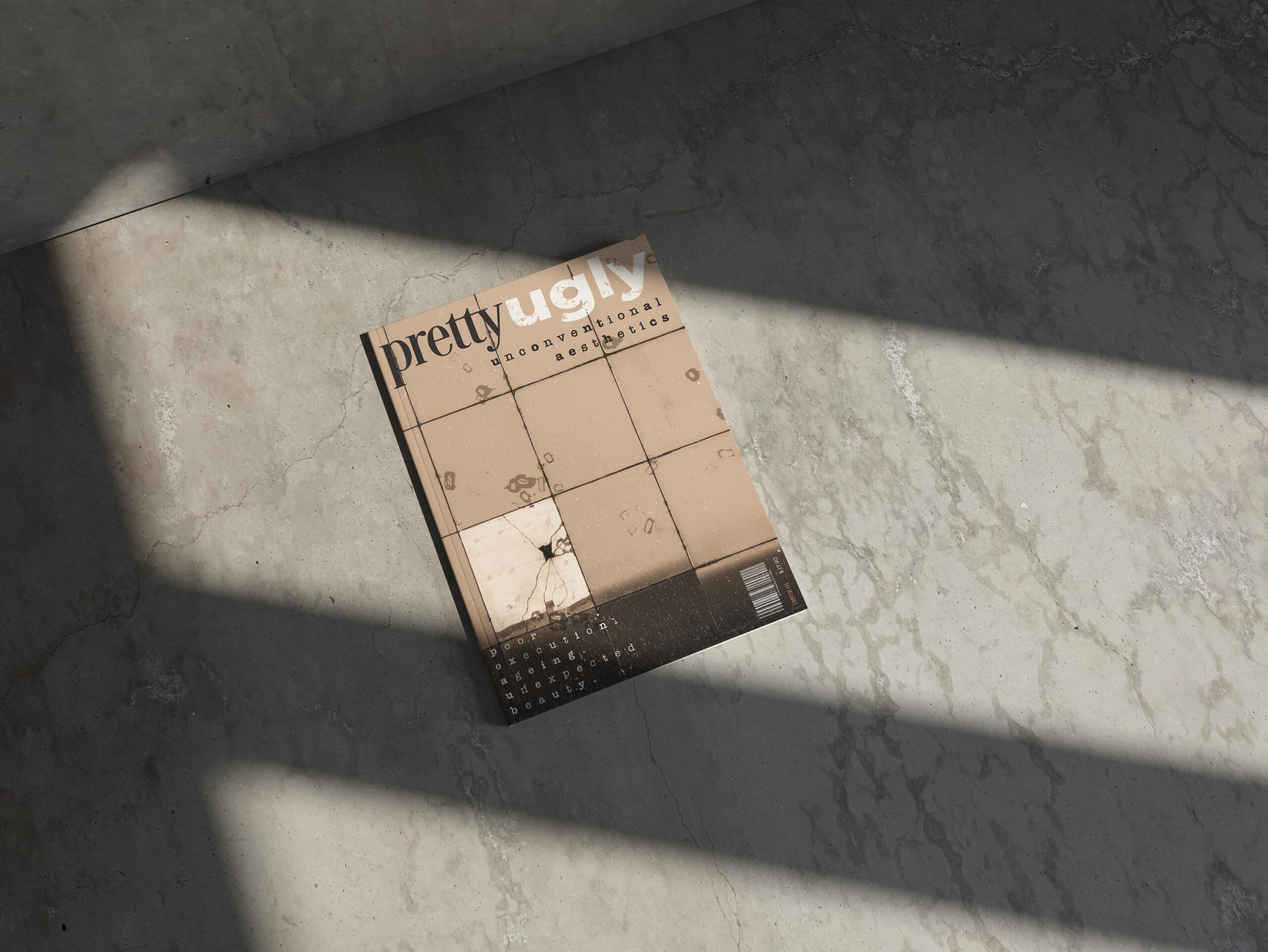
pretty ugly magazine
A print magazine that celebrates what "should" be ugly but feels beautiful anyway. Designed as a space for young creatives to find unfiltered visual inspiration.
Client
Self-initiated
Year
2023
Role
Graphic Design
Design & Direction
The brief for this project was pretty simple: create a magazine about something I'm genuinely passionate about, and fill a gap in the market. For Pretty Ugly, that meant building a space for young creatives who want regular inspiration without the rules. No excess of trends, polish, typicals, or what's currently considered "pretty."The design of the magazine attempts to blend grunge, brutalism, and lo-fi print techniques, using personal imagery, sourced essays, and expressive typography design. Alongside the main publication, I made a series of process zines that document the making of the magazine - experiments, type tests, misprints, and design reasoning, working to turn the behind-the-scenes work into part of the project's visual language.


Impact
Pretty Ugly became a way for me to experiment without guidelines, especially in typography and unconventional layout systems. The zines alongside helped to strengthen that open-minded creativity by showing the "mess" behind the final product. For young designers this magazine format gives permission to break format in their own work; for me, it solidified a design approach I was passionate. Letting me bring tension, contrast, and major expression of the design principles I had learnt into my future work.
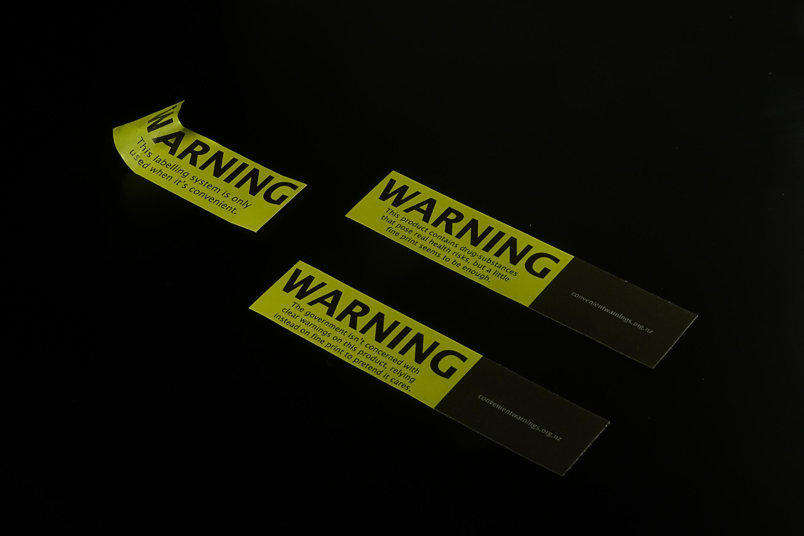
Convenient warnings
A speculative poster campaign that flips health messaging on its head; if cigarettes graphic warnings, why don't other harmful products?
Client
Self-initiated
Year
2024
Role
Concept and Collateral Design
Design & Direction
New Zealand's approach to health regulation warnings is ridiculously uneven. Cigarettes are covered in photos of diseased lungs by law, but alcohol, energy drinks, and painkillers (all with their own serious risks) get off with off with an, often undescriptive, small disclaimer on the back while looking like lifestyle products.Convenient Warnings started as a DIY protest: take the government-mandated cigarette labelling system and apply it to everything else that causes harm.I started by redesigning common product packaging using those same brutal warning systems: ugly colours, standardised fonts, and grotesque warnings, then shot them like ad campaigns. The end results were somewhere between believable and absurd, forcing people to double-take on their favourite products. Alongside the posters, I came up with a guerilla sticker campaign: tear-off flyers and handouts placed around universities and public spaces that let others label products they felt were deserving of a warning. It was about trying to expand the conversation to more people, not just to point fingers.


Impact
The result was a campaign that tried to hold up a mirror to how we as a country treat health risks. The dissonace of seeing your own favourite products with these same mandates hit immediately: if warnings are a matter of public health, why are they applied so unevenly? The hijacking of the languagte people already associate to danger helped the project to challenge viewers to spot the biases.The campaign aimed to, and effectively, made people reflect on the question: what if we took our own rules seriously?
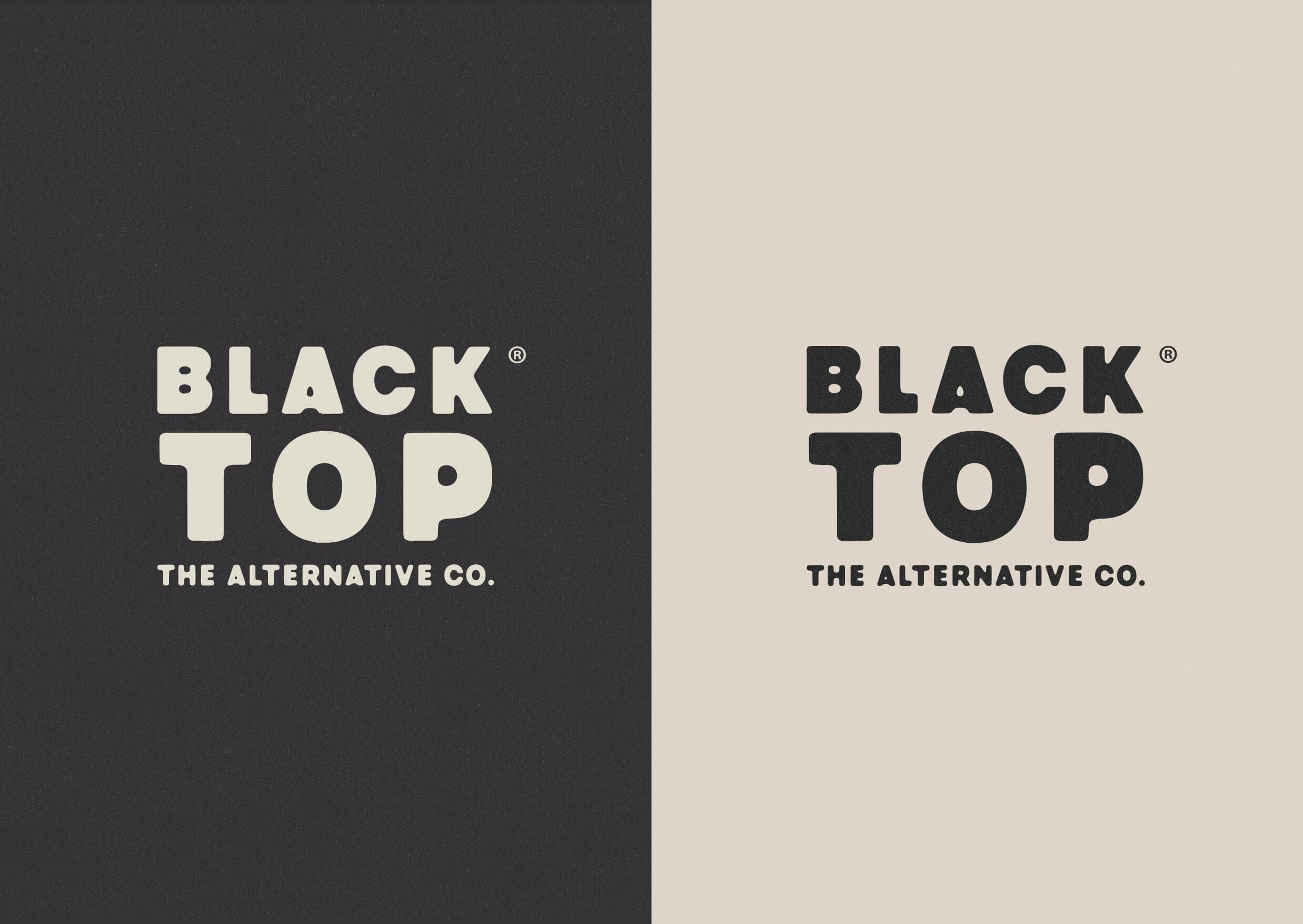
blacktop co
A fictional alternative-dairy brand that doesn't play nice. Built to look mainstream in the grocery aisle, but call out dairy's typical audience using reject copy.
Client
Self-initiated
Year
2023
Role
Concept and Design
Design & Direction
Blacktop started as a packaging and messaging experiment. It's goal was to flip the script on plant-based dairy alternatives by treating it like the new default, not the quirky product in a separate aisle. Instead of being apologetic or conceding for it's alternative nature, it's tone is proud, disruptive, and a little antagonistic.The visual identity is influenced by old-school American dairyu branding; milkman-era packaging, oversized type, and a nostalgic monochrome palette. That familiarity gives the satirical nature some weight. It doesn't whisper that it's sustainable or "eco", rather, it speaks in reject copy slogans, rough print textures, and confident black and white. Everything from the ads to the cartons themselves points to one main message: if you're consuming dairy, you're behind.


Impact
Blacktop isn't real, but the response to it was. The brand was believable enough to pass as shelf-ready and punchy enough to get the message across. It helped to spread awareness for a bigger issue: plant-based alternatives are still positioned as substitutes and have their prices and accessibility affected by this. Blacktop flips that power dynamic by framing dairy as the outdated choice.
AUT Student Association
(AUTSA)
An ongoing maternity-leave design role at AUTSA covering major student campaigns, events, and the day-to-day brand systems that support them across campus.
Client
AUT Student Association (AUTSA)
Year
2025 - Current
Role
Lead Designer

Reorientation 2025
The mid-year reorientation can often fall a bit flat. It's a lesser sibling to O-week and also shows up at a time where weather's worse, the energy's lower, anduni feels more like a drag than a fresh start. The concept of Just Warming Up leaned into that to turn, what could be, a tone-deaf campaign into something ironic, warm, and actually relatable. The identity centered on a thumbs-upping sunglasses emoji that is literally melting. Paired with hot colours, energetic typography, and chaotic movement, it captured the lowkey burnout of students entering semester 2. A sarcastic tone of voice throughout tied it all together with interactive models (built in Blender and Spline3D) gave the campaign the same life outside the posters.
The outcome of the campaign was straightforward, it worked because it took the audience's painpoints into account and lined up as a cohesive concept. The same language was used throughout the posters, socials, and site, so it felt like one system instead a pile of stock assets. The campaign saw a big jump in engagement, with the website getting just over 14,000 visits that month, up from roughly 5,000 the month before.


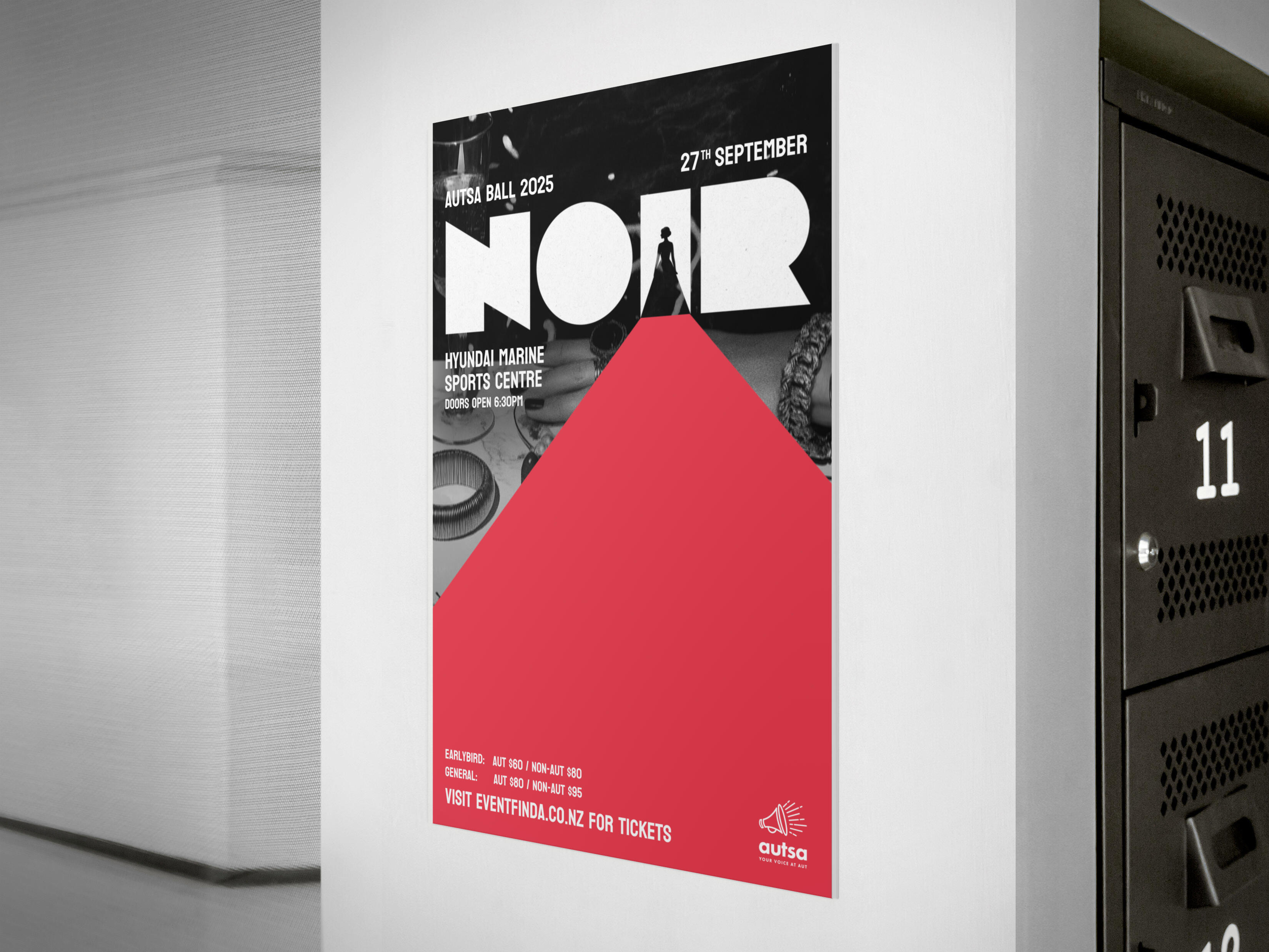
NOIR Ball
An event identity for AUTSA’s annual ball, leaning into a darker, editorial tone across posters, digital assets, and on-site collateral.
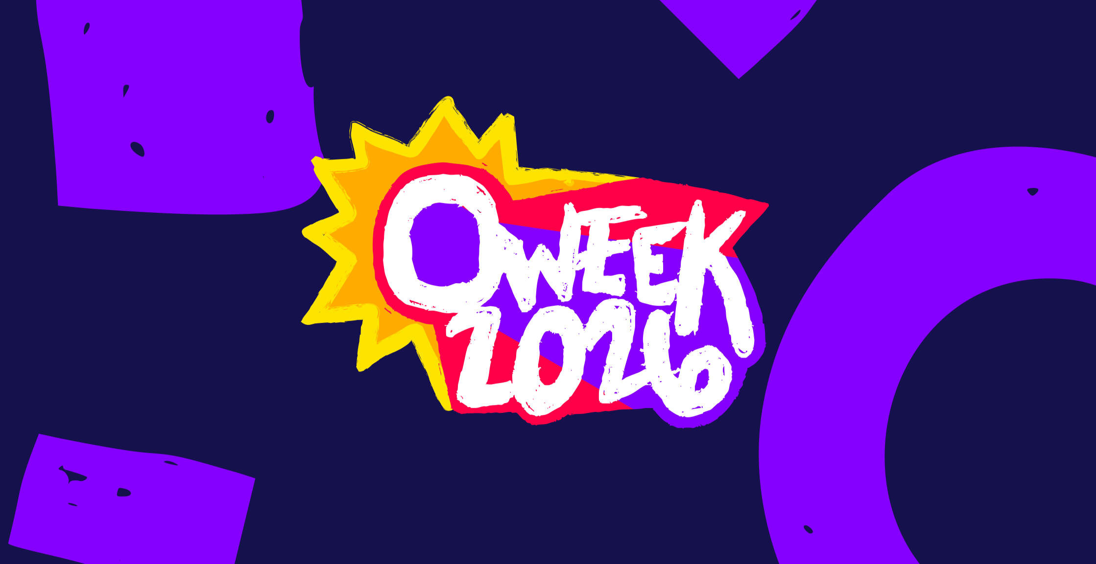
O-week 2026
A yet-to-be-published start-of-year orientation identity built to scale across print, social, signage, and schedules, balancing flexibility with consistency in a high-visibility campaign.
AUTSA Branding
Day-to-day brand work including wall planners, certificates, social templates, photo backdrops, club resources, presentations, and large-format print. The focus was reliability, clarity, and consistency across touchpoints.


Impact
Working across campaigns and everyday brand outputs meant thinking less in one-off visuals and more in systems. The role required consistency under tight timelines, adapting the brand to different audiences while keeping it recognisable.The result was a cohesive visual presence across AUTSA’s events, communications, and resources, with tools and templates that made the brand easier to use and maintain across the organisation.
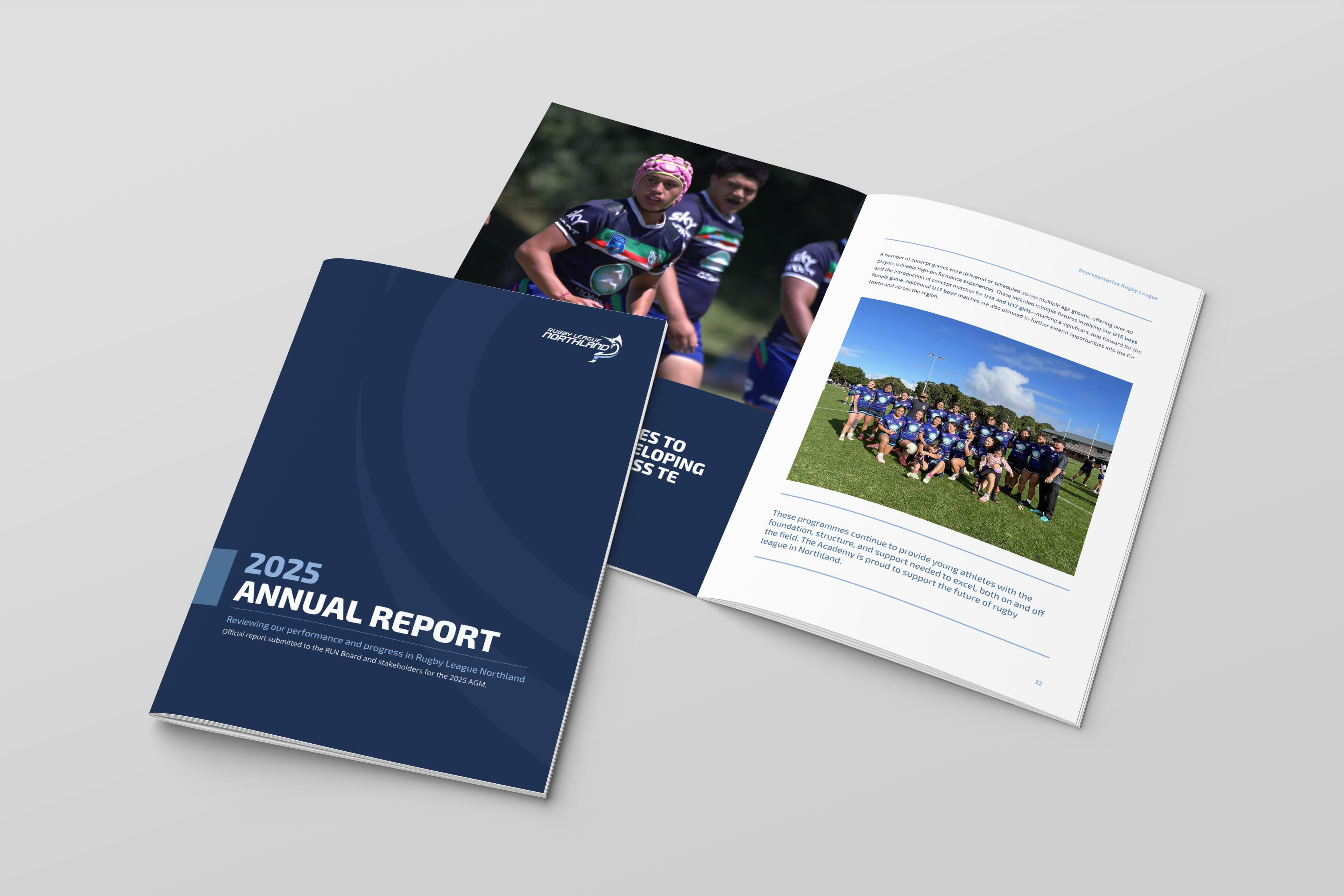
rugby league northland
A long-term design collaboration across campaigns, collateral, and brand systems for a regional sports body doing big things for community rugby league.
Client
Rugby League Northland
Year
2023 - Current
Role
Graphic Design
Design & Direction
Rugby League Northland has been an ongoing design collaboration; one that spans everything from vehicle decal design to alcohol awareness campaigns. Working closely with the CEO, I’ve had a rare opportunity to build the brand up from the inside: updating the tone, visual identity, and digital presence over time. Projects have included full brand guidelines, a full social media kit, decals for league cars, custom rugby balls, presentation decks, and everything in between.Each small project aims to balance a bold, sporty, grassroots energy with a sense of modern professionalism one might expect to see from a regional sports body, especially when you’re speaking to both local clubs and stakeholders across the country. That meant keeping things flexible in purpose: consistent logo variations, structured type hierarchies, traditional, but strong colour choices, and layouts that feel consistent across print, social, and signage.


Impact
What makes this work matter is that it's practical. These assets aren’t just mockups, but rather in use across events, vehicles, socials, and handouts seen by thousands of people across Northland. The “Play Smart, Drink Smart” campaign gave the organisation a strong voice around youth alcohol awareness and made it's way through NZRL. The social templates helped unify the messaging of the brand under a new clean look. And the refreshed brand guidelines continue to give the marketing team a visual language to work with and continue.This work has helped Rugby League Northland stand out amongst its peers by showing a professional and consistent image and tone.